By: XEONIQ [ Instagram | Tumblr ]
Introduction
In an age of near-instantly delivered stream-on-demand video, high speed AI-gen imagery and social media algo-distributed digital content, literature has lost it’s once highly influential status in popular culture.
I don’t know when it was exactly, but at some point the literature publishing industry decided to, rather than supporting creative artists and graphic designers, release new and re-printed novels with extremely low effort, to the point of being ugly to look at, covers. While some contemporary niche presses have realised this issue and release classics in expensive hard cover format, the once thriving market for commercial soft cover novels in the 20th century appears completely dead today. While literature is a medium of the mind, cover art of mass produced novels did contribute to the imagery of the cyberpunk genre, even if that seems contrary, in the same way that fantasy and young adult cover art formed visual conceptions in the minds of their readers.

While books are for reading, and not collecting for their covers, it should be said that clearly very talented artists were once commissioned to create covers, and Japan in the 20th century has put out some really unique and exquisite art, particularly in the SciFi genre (or SF as they refer to it in Japan). As we are now inundated with AI-generated images, especially in the cyberpunk and science fiction fields, I thought it was important to preserve these human-created artworks, even if they were made for commercial purposes to sell translated books.
The Method
The titles in this selection have not been picked for their literary qualities, and many do not fit cleanly into the cyberpunk sub-genre. Some covers I tried to find intact, but couldn’t such as Voice of the Whirlwind, or they were found, but they were simply just very poorly done, like PKD’s Do Android’s Dream of Electric Sheep, or Gibson’s Mona Lisa Overdrive. This list is simply a collection of mostly cyberpunk and a few adjacent period SciFi covers that I thought worked with the theme for preservation.
The method that I used to collect these covers was by going through Japanese auction sites such as Y!JP, Mercari and Amazon.jp, collecting any I thought stood out. Most of the images were under 500 pixels high and taken with a smart phone of a used copy of the novel, and in rare instances Amazon Japan had a better quality cover available to start with. I then edited the files using Affinity Photo, which is now available under a “freemium” license, trying to preserve as much as possible while increasing the resolution, which was often poor. In some cases details are lost.
If one or more of these books are among your favourites, you might enjoy seeing how their cover was imagined by a completely different culture and literature industry. It was a fun exercise to collect and restore these covers, and in some cases prompted me to read some of the books I had not yet started. Enjoy.
Index
Clicking on one of the thumbnail covers below will take you to its higher resolution entry with a short list of details and a synopsis of the corresponding title.






Philip K. Dick
While the majority of PKD’s work is science fiction, I personally believe that it was Ridley Scott’s film adaptation of Dick’s Do Androids Dream of Electric Sheep? that gave the cyberpunk sub-genre enough inertia to sustain a short-lived (but now currently revived) cultural movement. That being said, PKD does have novels set in a near dystopian future, which take a postmodern, and sometimes realist edge, lacking aliens, time travel, or other science-fiction tropes that are not shared with the cyberpunk sub-genre. Together with PKD’s critiques of the system, some of his work set in the near future, such as A Scanner Darkly could be considered proto-cyberpunk.
I don’t believe that any of these covers are even the first edition translations for PKD’s work but rather the publisher invested in a good artist for a re-print. A Scanner Darkly is my favourite book from this article in general, but its cover, while having a vivid 80’s aesthetic, is the least creative of the three.
A Scanner Darkly | 1977
Set in Orange County, California, an undercover narcotics agent’s dual identity begins to blur as his addiction to a mind-altering drug he is assigned to eradicate begins to affect his neurological functioning. Oftentimes humorous, but also insightful, A Scanner Darkly introduces several interesting novum and grapples with the ethics of surveillance technology and the war on drugs. Like the majority of PKD’s later work, A Scanner Darkly is highly introspective and layered with events and people from his own life. As one of the few novels PKD wrote that received professional editing, A Scanner Darkly is often regarded as his best work next to Ubik! and a good starting point for those who have not read his books.

VALIS | 1981
While most of PKD’s later works have a semi-autobiographical component, VALIS (Vast Active Living Intelligence System) is a deconstructivist reflection into PKD’s psyche as he grapples with his long-term drug use, relational and family issues and schizophrenia. In the novel, the author and his alter-ego, Horselover Fat, switch between reflections on theology and a quest he undertakes with close friends to uncover the source of a divine event he experiences. VALIS, like the Transmigration of Timothy Archer and Deus Irae, has a significant spiritual component. It is not the most accessible novel and may be better to be read if you enjoyed A Scanner Darkly, which touches on similar themes, and is a more straightforward reading experience.

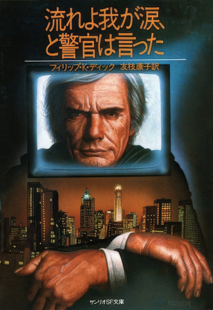
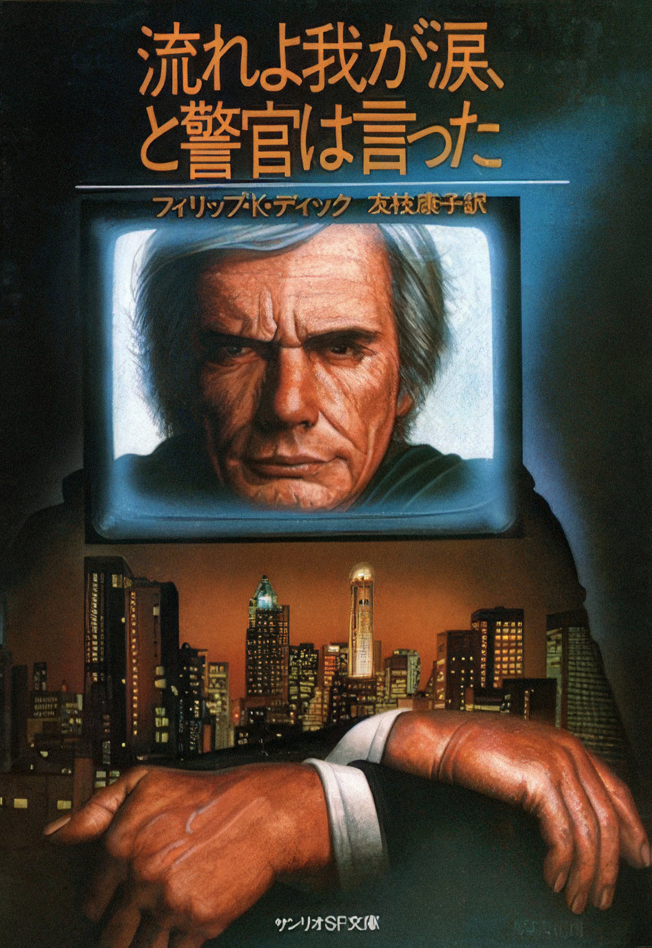
Flow My Tears, the Policeman Said | 1974
A famous entertainer wakes up in a dystopian future police state where he is no longer recognised, prompting a search for the cause of his non-existence. This novel is notable for supposedly containing an embedded “cipher”. More science fiction than it is cyberpunk, Flow My Tears does explore a number of relevant themes for today including authoritarian use of technology and media’s effects on identity.
Bruce Sterling
Sterling is one of the more imaginative authors in the cyberpunk genre, which tends to veer many of his work into science fiction, if not fantasy, however, in my opinion, the Japanese covers for his books are the best done in this list. Schismatrix and Cicada Queen both feel distinctly Japanese. Thanks to the research I did for this article, I recently read through Sterling’s Taklamakan short story set in that titular Western Chinese desert.
Cicada Queen | 1983
One of five of Sterling’s short novelettes set in his Shaper/Mechanist universe, where humanity is split between two factions: the genetically engineered Shapers and the cyber-augmented Mechanists. Cicada Queen features characters from Schismatrix and is firmly in the science fiction genre rather than cyberpunk with its far future setting, space travel and alien elements. Like Schismatrix, the cover is well done, clearly by the same artist.

Schismatrix | 1985
This is the only full length novel Sterling wrote in his Shaper/Mechanist universe. Schismatrix is more fully realised than the original short stories and novelettes like Cicada Queen and again, is a very fantastical science fiction work set hundreds of years in the future amidst the struggle between the two posthumanist factions of humanity. Despite not being in the cyberpunk genre, Schismatrix‘s cover (and title in my opinion) is easily the coolest in this set with an ultra-masculine, mechanically-augmented subject who exudes the kind of 1980’s aesthetics that came to be associated with cyberpunk.

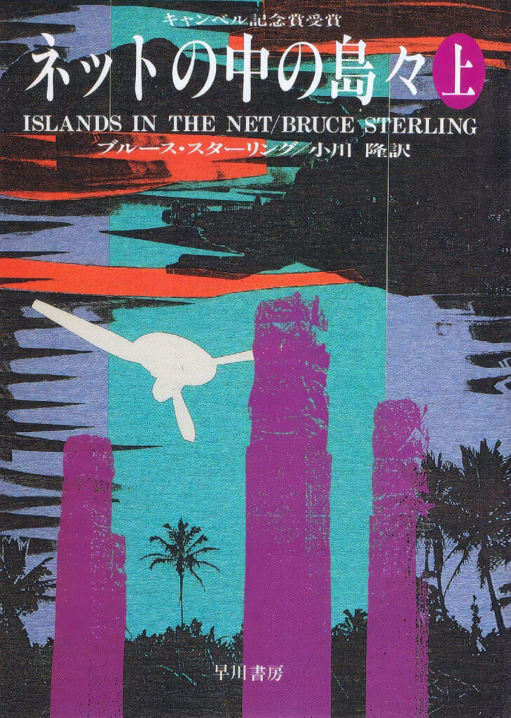
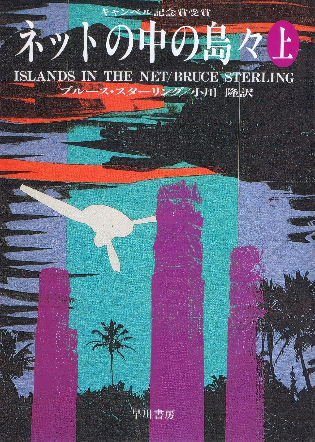
Islands in the Net | 1988
A distinctly more “cyberpunk” novel from Sterling that follows a corporate representative between various poorly governed data havens around the world. Near future and dealing with the impending transnational governance issues which we are still embroiled with today, Islands in the Net is a geopolitical terrorist thriller with the kind of satirical postmodern irony that defines the cyberpunk genre. Markedly different to the Shaper/Mechanist universe covers, Islands in the Net has an attractive vivid photocopied aesthetic with well-placed typography.
William Gibson
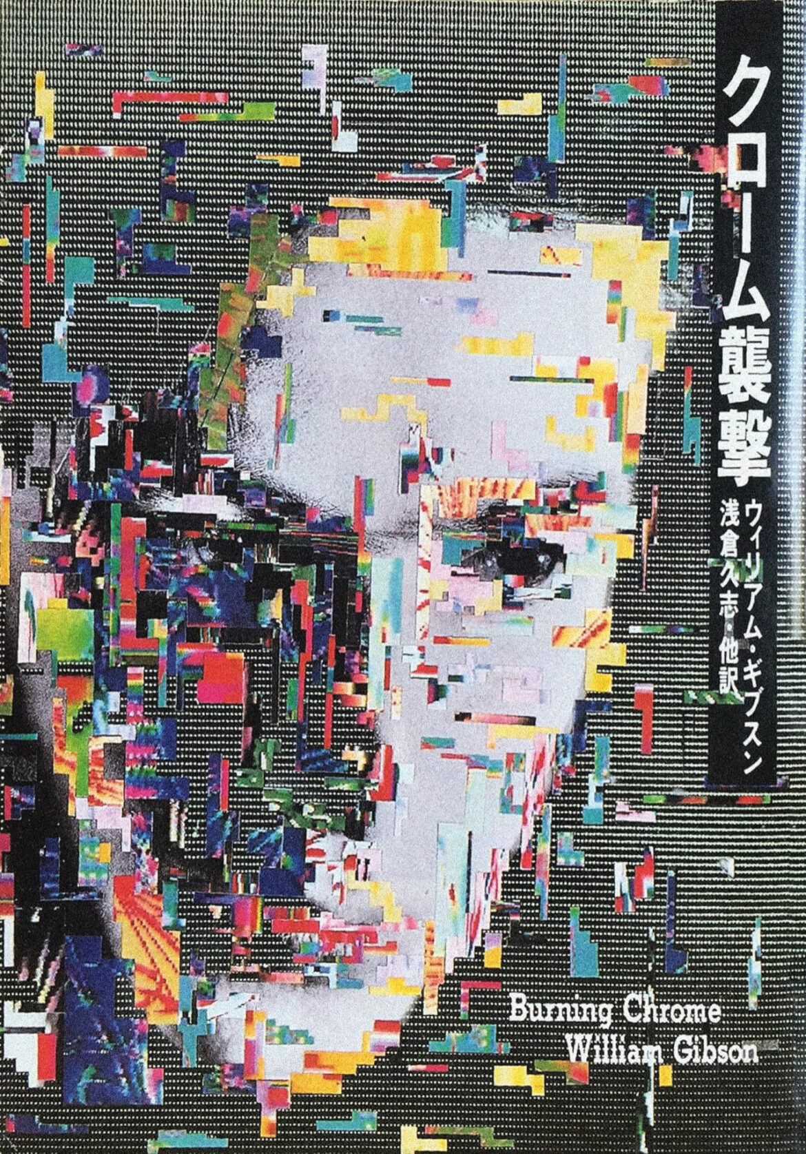
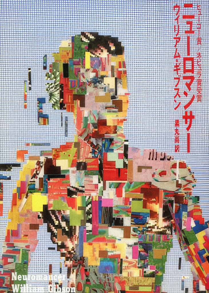
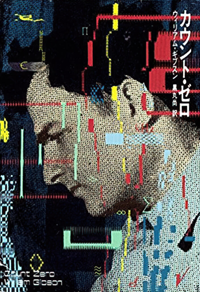
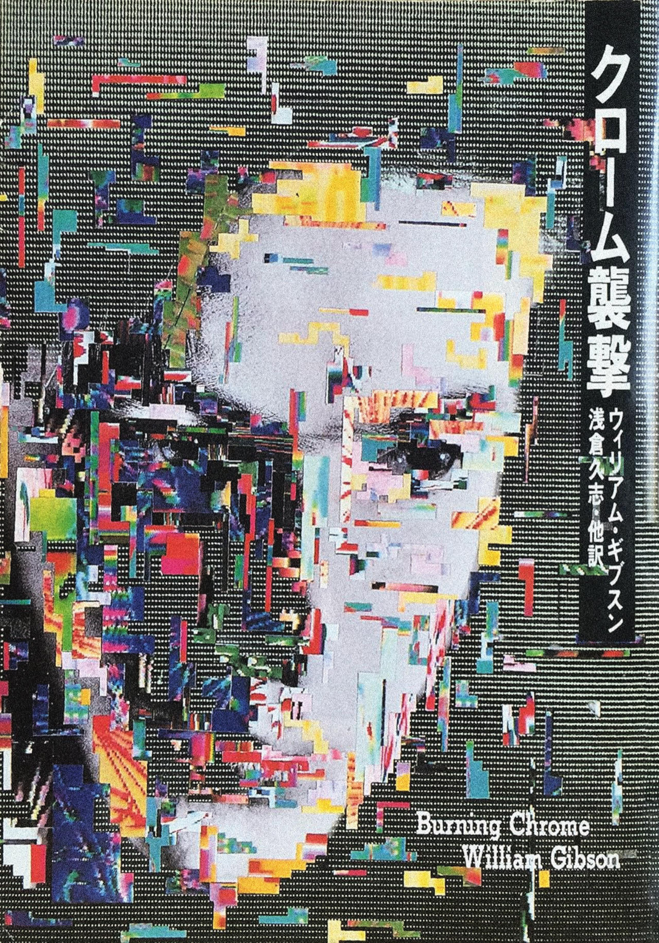
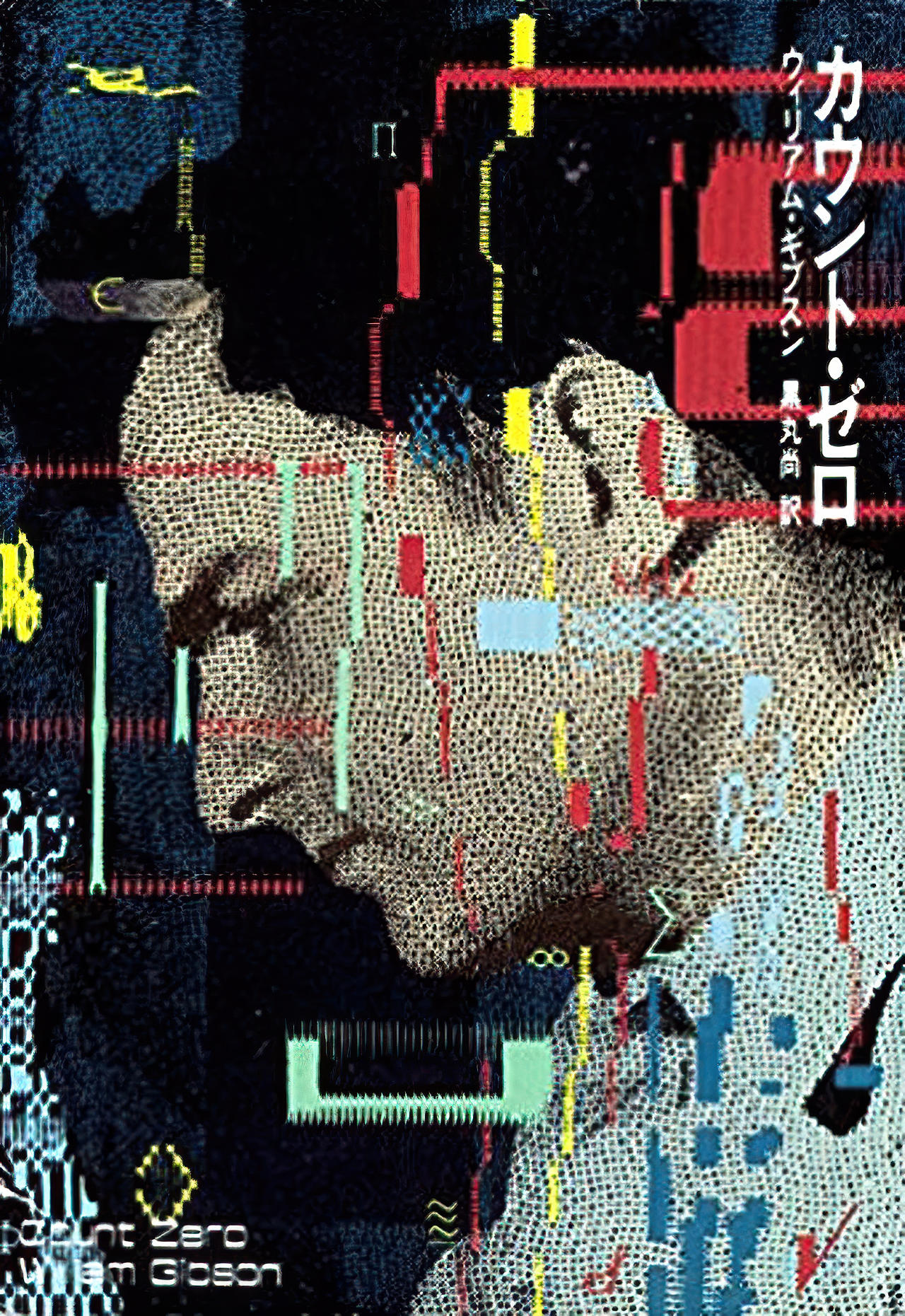
Despite heavily referencing Japan in many of his works, the Japanese covers for Gibson’s novels are not as impactful or relevant to the narratives in each story, in my opinion; and the art used for his Western releases are superior, especially Neuromancer’s excellent original softcover. Even so, I’ve included the best of the Japanese covers that I found due to Gibson’s importance in the cyberpunk sub-genre. I think Burning Chrome is the better of three in this cut-out /glitch style as far as the art is concerned; these three covers selected were all done by Japanese artist, Yukimasa Okumura. The Japanese cover for Virtual Light, my favourite Gibson book, wasn’t worth including unfortunately.
Neuromancer | 1984
One of the most well-known cyberpunk novels, its Japanese cover is one of the weakest in this set in my opinion and included only because of the book’s popularity. For those who have not read this Neuromancer, it follows a disgraced, drug-addicted computer hacker named Case who is induced by a mysterious man named Armitage to perform a series of data and physical heists as part of a mercenary team. Action packed with vivid imagery, the book exudes style over hard science, and it borders on fantasy at times than it does science fiction; with Gibson having said he had no technical understanding of how computers worked while writing this first novel.
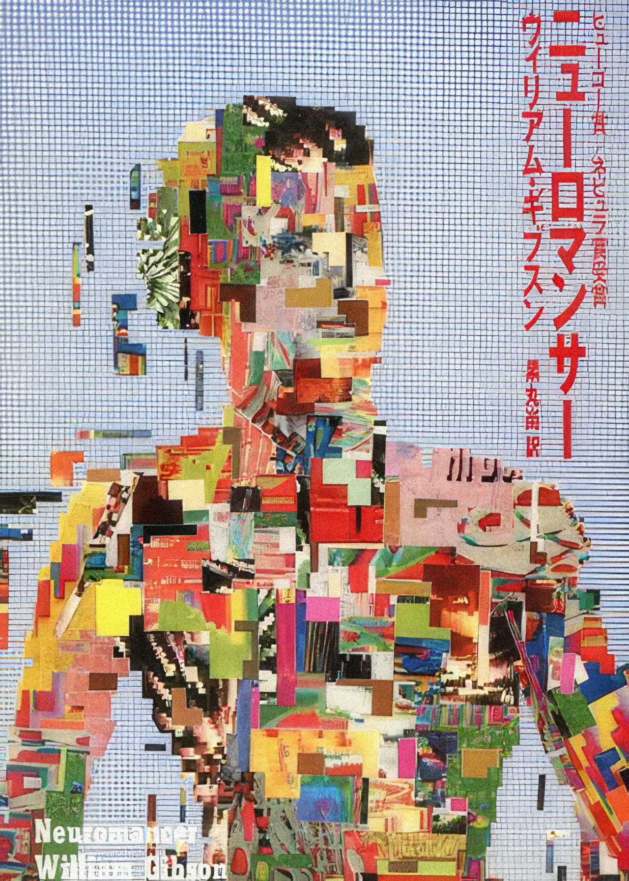
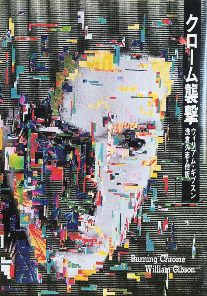
Burning Chrome | 1986
A collection of cyberpunk short stories, including Burning Chrome which was first published in Omni magazine in 1982 and introduced the term “cyberspace”. Notable stories include the title story, where two hackers attempt a massive score, Johnny Mnemonic, about a data courier caught in a bad deal, which also features The Sprawl Trilogy’s Molly Millions, and New Rose Hotel, which involves a corporate espionage set in Narita. This set of shorts is a good introduction into Gibson’s style for new readers. This cover is best of the three with a better use of neon colours, a menacing photocopier-style visage and makes good use of its Japanese vertical typography.
Count Zero | 1986
My favourite novel from the Sprawl Trilogy, set following the events of Neuromancer, and based around three intertwined sub-plots and characters including: an inexperienced teenage hacker saved by a mysterious presence during a bad run, a corporate mercenary tasked with extracting a scientist and his daughter from a bio lab, and a dealer who is hired to track down strange art works. Again, Count Zero borders on fantasy, with a plot involving a girl who has biological implants to access cyberspace, more than it is hard science fiction or even relevant near future trends, but Gibson does well in evoking stylish imagery in his work. This cover is poorly done but is in the same style as Gibson’s other two Japanese releases.
Neal Stephenson
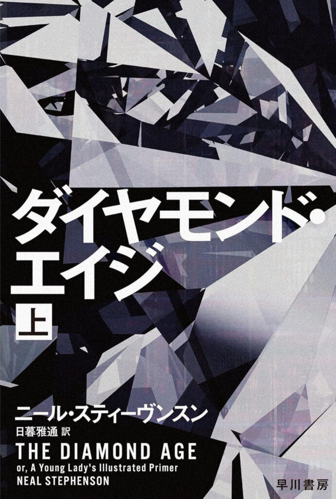
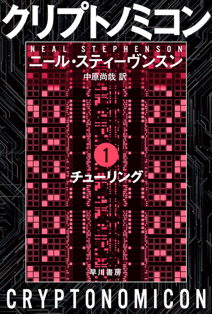
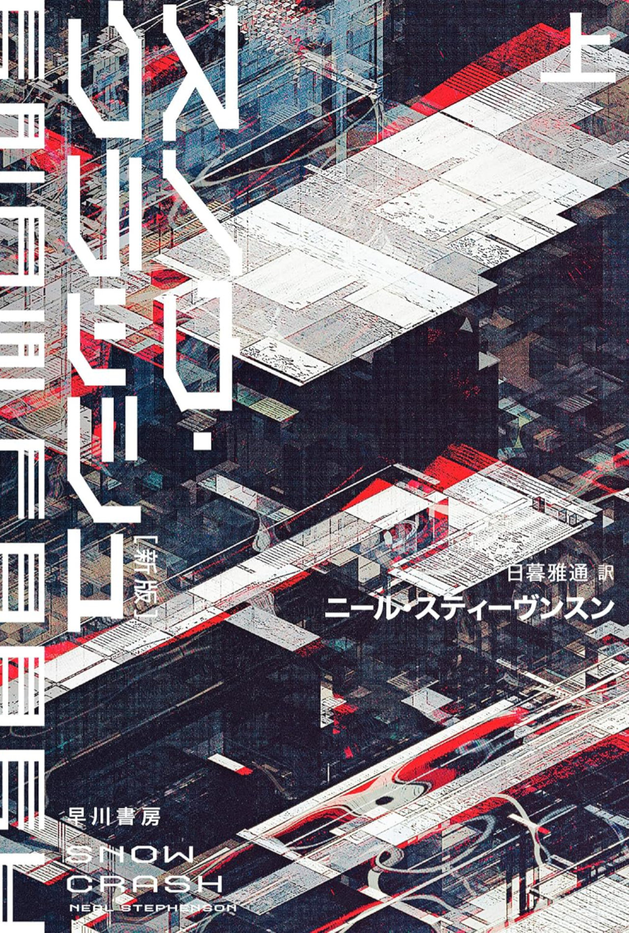
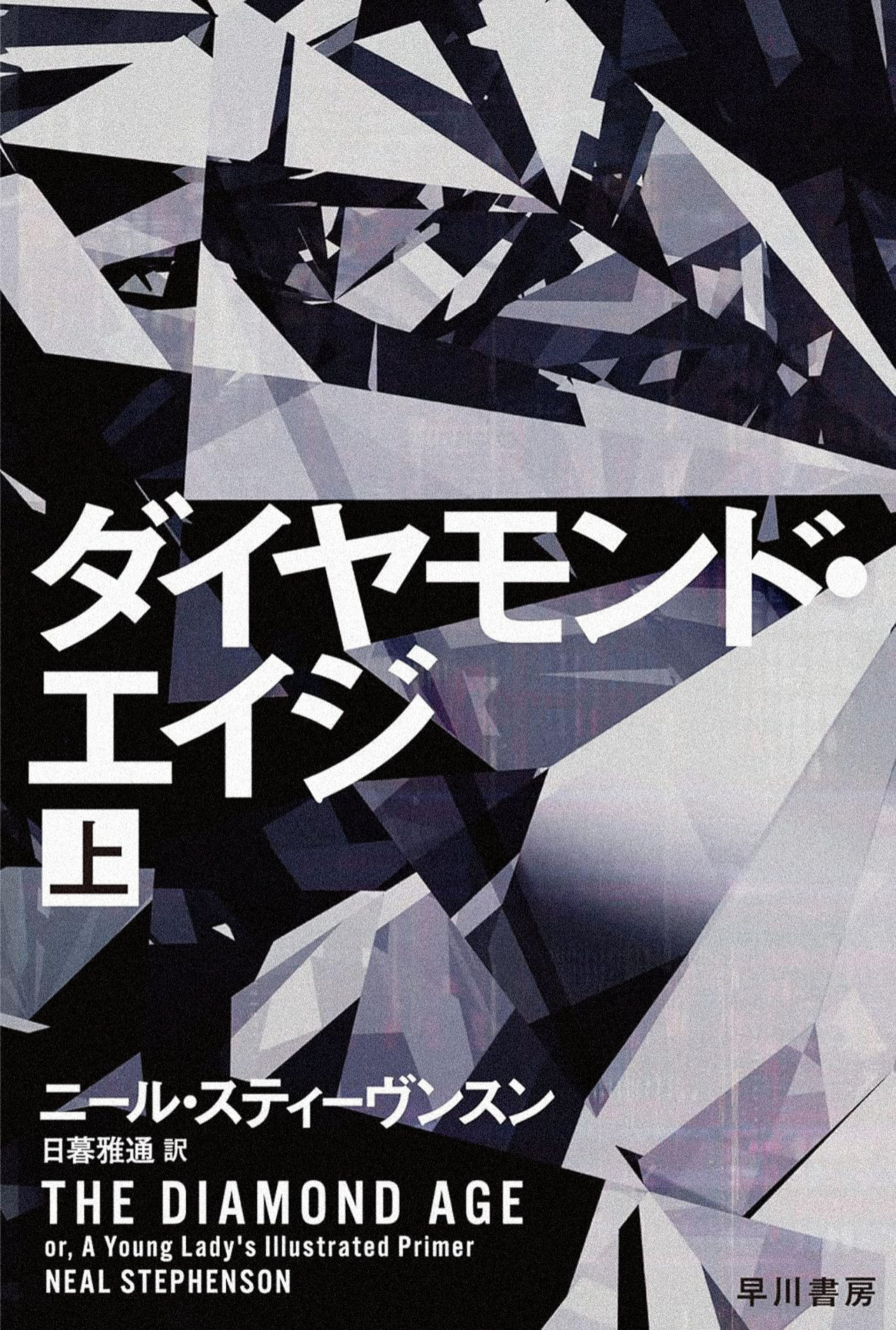
Stephenson’s tongue in cheek, humourous writing style is not for everyone, but he genuinely has put forward a lot of creative ideas that have turned out to be more prescient than Gibson’s work, including coining the MetaVerse term that became Zuckerberg’s pet virtual reality project. These 90’s covers lack the charm of the 70’s and 80’s art in my opinion, but unlike Gibson’s Western covers, which were typically quite good, Stephenson’s Japanese market illustrations are better than the even more banal original Western release covers.
Snow Crash | 1992
Snow Crash is almost a Terry Gilliam-esque cyberpunk book where a katana-wielding multi-racial pizza delivery driver / hacker aptly named “Hiro Protagonist” works together with a teenaged courier on a high-tech harpoon-equipped skateboard to uncover a plot involving a computer virus drug administered in virtual reality that can cause neurological damage in real life. If that sounds too much, it is, and that is on purpose. This novel is humorous and throws every kind of cyberpunk cliché it can think of into its roughly 500 pages. I would have preferred a more “fun” cover based on how satirical Snow Crash is, but the cover design and typography are done well regardless.
The Diamond Age | 1995
In a medium-term future completely reshaped by nanotechnology, society has become neo-Victorian and a powerful interactive educational book intended for a very wealthy lord’s child, falls into the hands, and ends up transforming the life of, an impoverished girl instead, which triggers a global upheaval. While this cover is quite abstract and modern more than it is stylish or 80’s, it is an attractive cover and this book is well regarded as science fiction, if not cyberpunk.
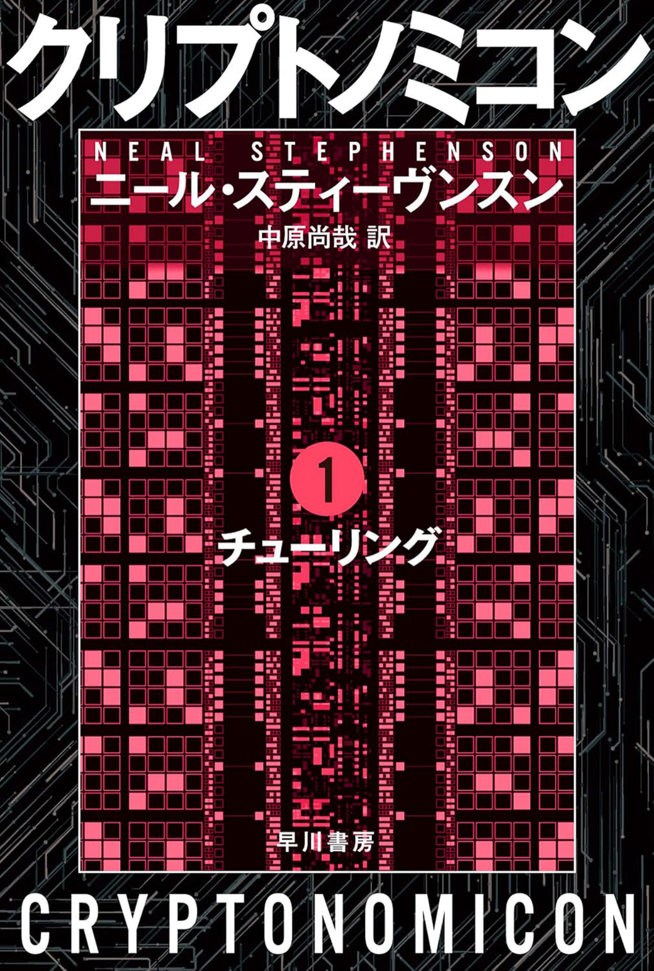
Cryptonomicon | 1999
A dual-timeline techno-thriller linking World War II codebreakers, who are trying to hide the fact they have broken Axis codes, with their 1990s tech entrepreneur descendants building a data haven in Southeast Asia, both sets of characters across time linked to buried wartime gold. This book’s Japanese cover is quite generic cyber or computer-based novel art in my opinion and the weakest of the three.
George Effinger
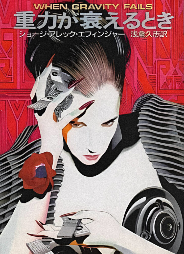
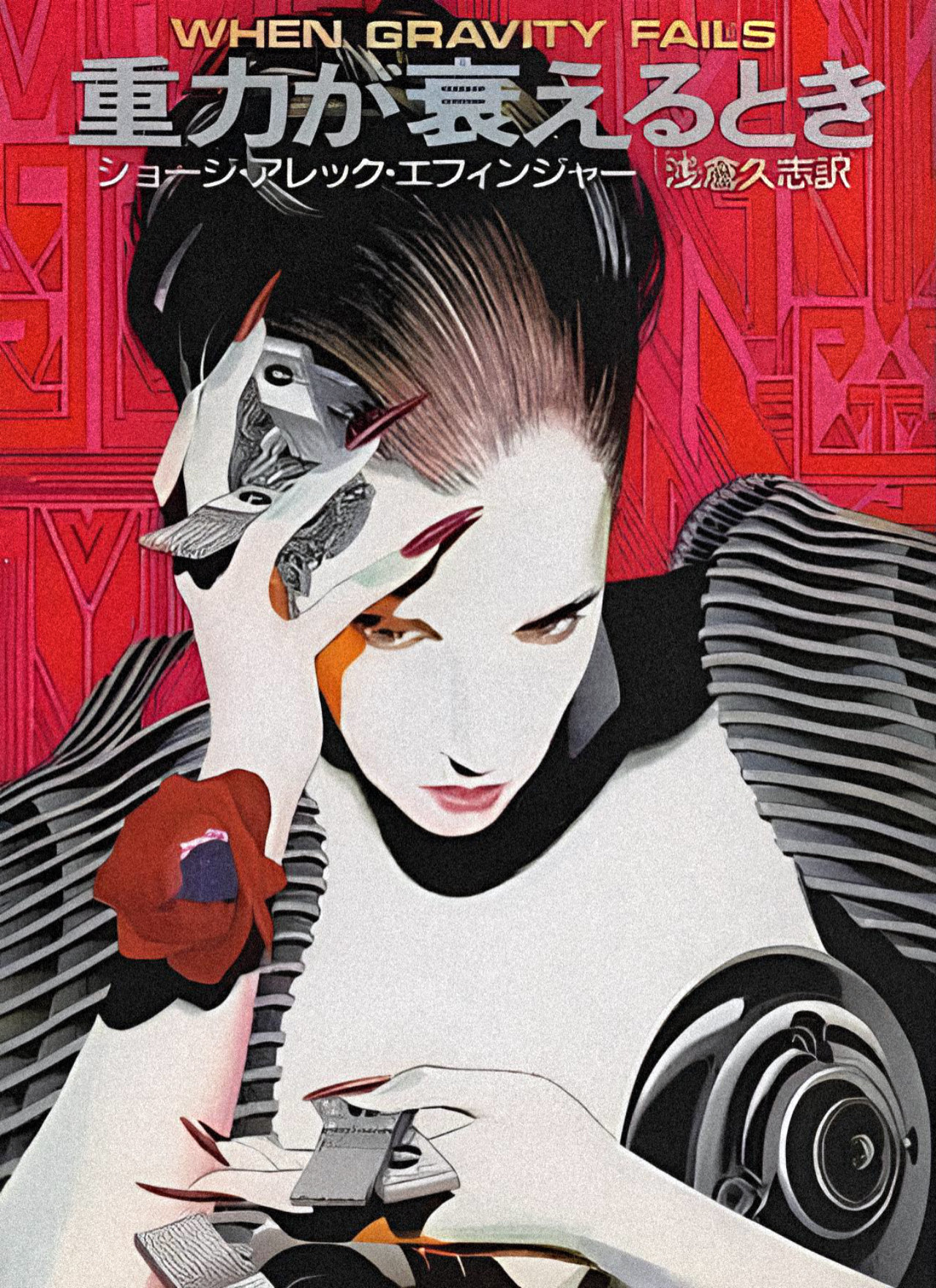
I’ve only read When Gravity Fails from this trilogy by Effinger, but he not only completely nails the cyberpunk genre, he brings it into a new setting, one where a Muslim caliphate has emerged as a dominant empire in the future. Effinger also explores transhumanism and gender transitions via surgery in an apolitical 80’s context and chip based modular cognitive training, and his books are not just novel because of being set in a predominantly Muslim future; they do explore technologies and cultural shifts that are relevant. Not as humorous as Snow Crash, but also not as self-important as the Sprawl trilogy, it meets in a nice healthy middle point in the same way that Hardwired does. It’s worth checking out the first book at the very least. The cover art for this trilogy seem at least a little Patrick Nagel-inspired, which feels appropriate for these distinctly 80’s era cyberpunk novels.
When Gravity Fails | 1987
In a near future where a Muslim caliphate has assumed global dominance, a lowlife dealer known as Audran living in the bustling multicultural metropolis of Budayeen is drawn into a dangerous mystery, working as an investigator for the city’s underworld kingpin, Friedlander Bey. This is a well-fleshed out world with interesting Muslim aesthetics blended with cyberpunk tropes and the mystery detective plot is enjoyable to read entertainment. I like that the cover for When Gravity Fails includes the chip implant learning technology, which is an important novum in these books.
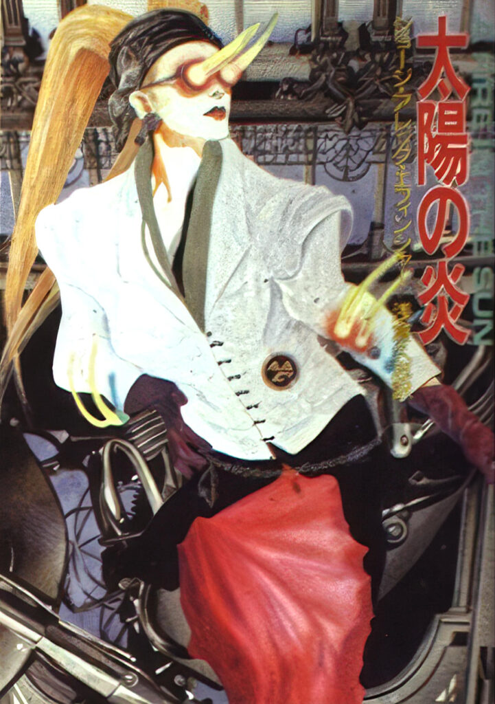
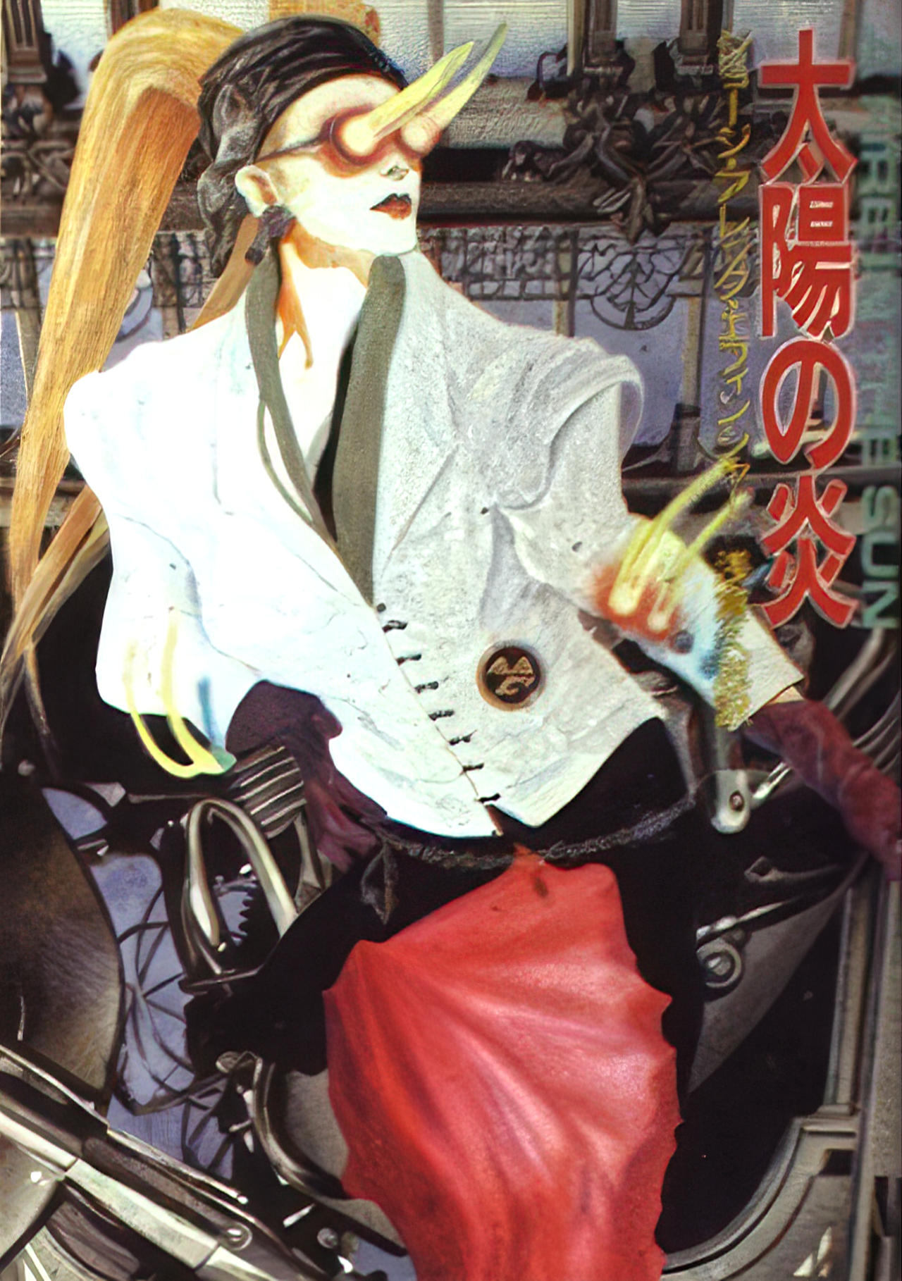
A Fire in the Sun | 1989
Now working as an enforcer for Friedlander Bey, the protagonist of When Gravity Fails, Marîd Audran, continues the narrative in the same futuristic, Muslim cyberpunk-noir setting of the Budayeen. The cover art in A Fire in the Sun is the weakest of the three, in my opinion.
The Exile Kiss | 1991
Framed for murder, Audra and Friedlander Bey are exiled to die in the desert, where they plot their return and revenge to conclude this trilogy. I enjoy this cover the most of Effinger’s three in this set because it more clearly blends some of the Muslim aesthetics into the frame, which are not as clearly illustrated in the previous two novels.

Joanna Russ
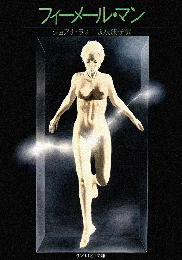
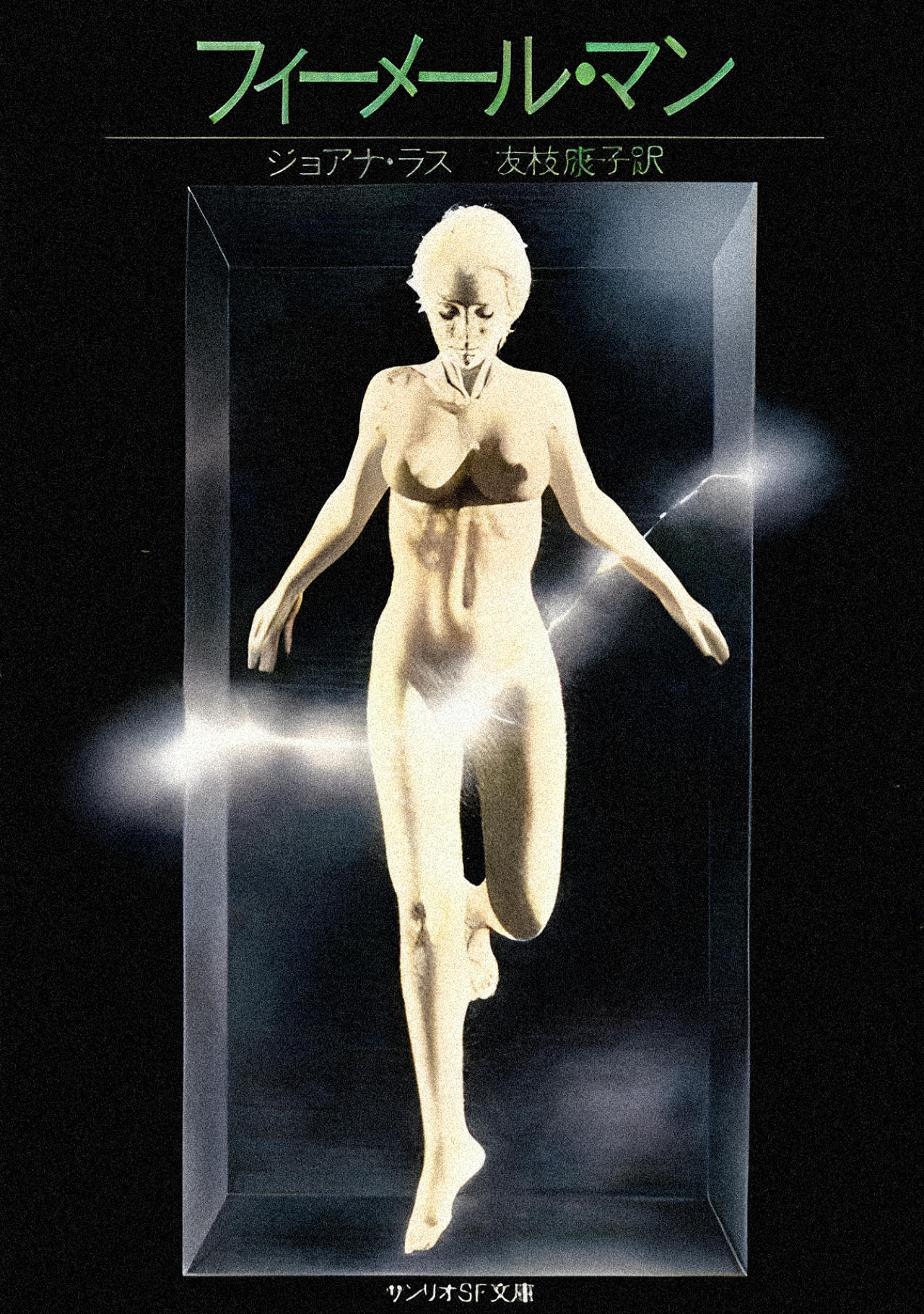
While not cyberpunk, The Female Man’s Japanese cover really stood out as a beautiful piece of art. It’s on my reading list.
The Female Man | 1975
Four women from four different parallel worlds: 1970s Earth; a Great Depression-era world; a futuristic all-female utopia; and a world at war between the sexes, each travel and experience one another’s worlds. The women’s lives are contrasted through debate, conflict and travel between worlds, exposing the social construction of womanhood.
J.G. Ballard
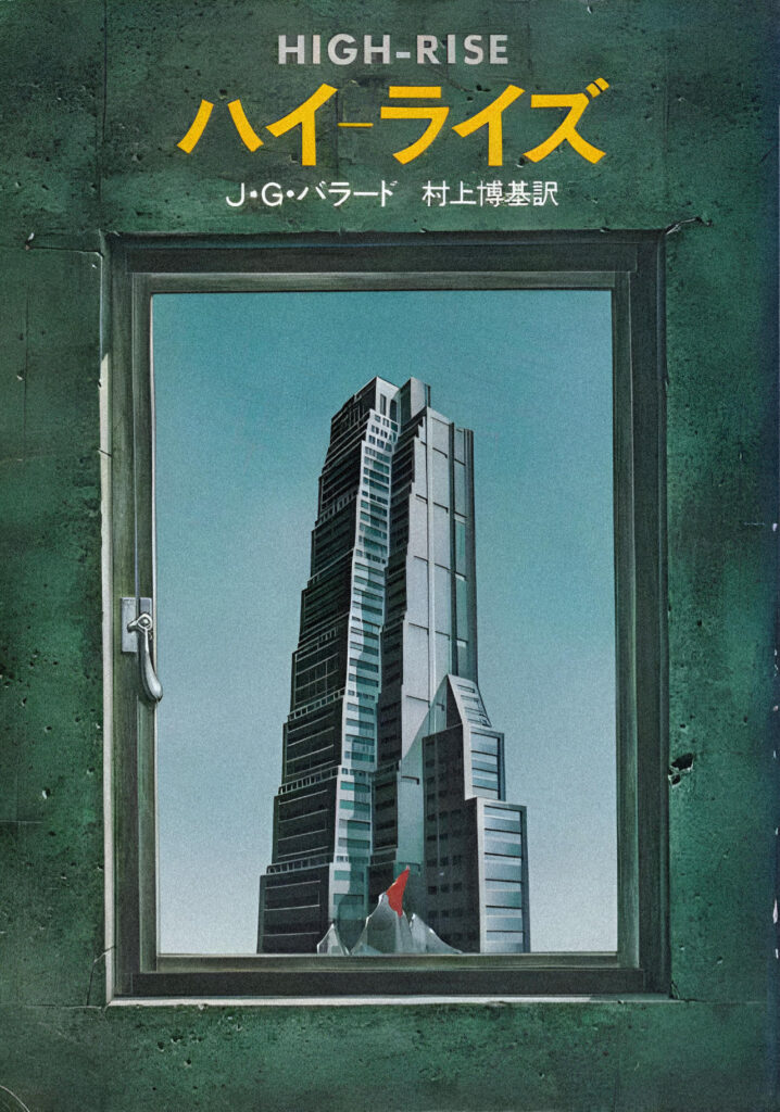
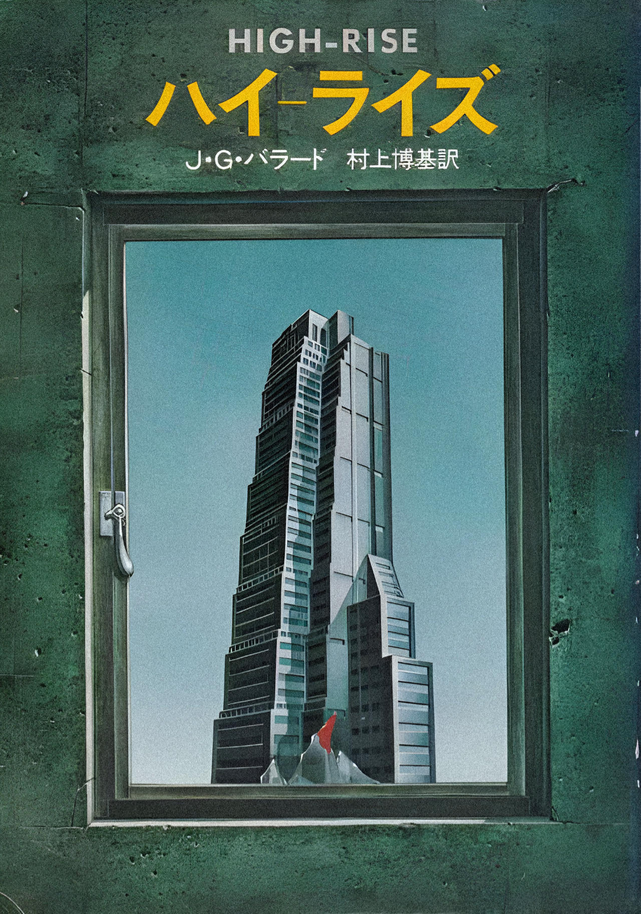
Ballard is easily the most accomplished author in this list. Crash is more relevant as a proto-cyberpunk text (and perhaps its themes are even more relevant today than on release), but, like many of the translated books I searched for, its cover art was not especially interesting or relevant for this list. High Rise’s cover however was extremely well-done and I felt deserved a mention here.
High-Rise | 1975
Set in the near future, the novel is based around a doctor’s experiences in his new, then futuristic, high-rise apartment building, as it descends into tribalism and savagery until it loses complete connection to the outside world. Visceral and surreal like Crash, High-Rise details the rapid social and psychological collapse of the affluent apartment residents in a satirical critique of what might happen as human beings more and more render themselves unto such living arrangements.
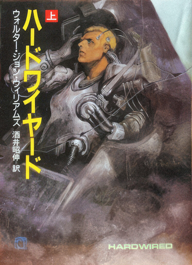
Walter Jon Williams
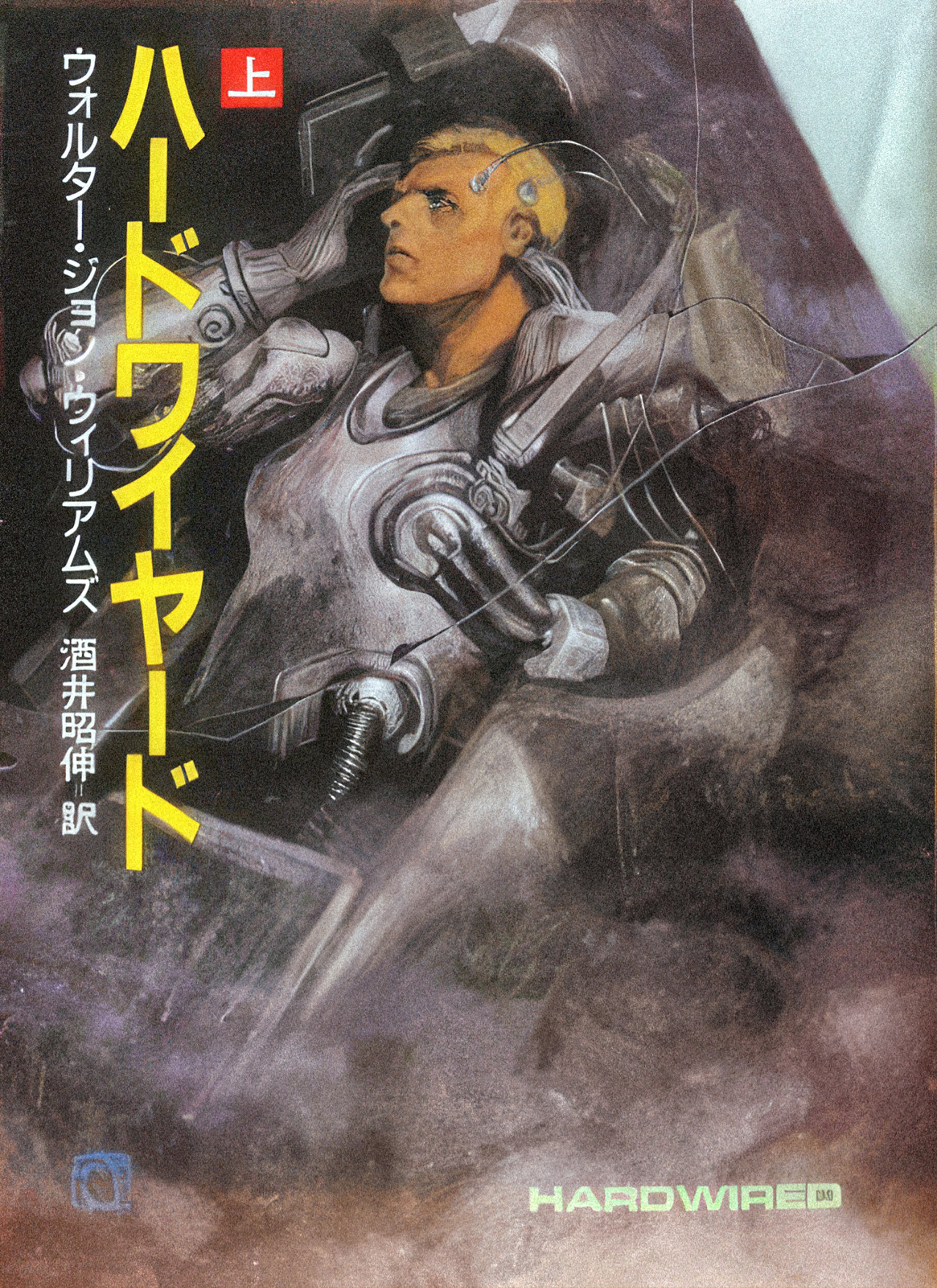
Hardwired is easily my favourite cyberpunk genre book in this list. Sadly, its sequel Voice of the Whirlwind, could not be found without its promotional cover, which obscures half the art. If you like more action-packed cyberpunk stories like Neuromancer, you will most likely enjoy both Hardwired and Voice of the Whirlwind. Williams found more success doing space-genre SciFi, but these two books and the connected short story Solip System are worth reading for cyberpunk fans.
Hardwired | 1986
An ex-pilot turned smuggler with a tactical hovercraft teams up with a freelance mercenary, both of them cybernetically-enhanced, to battle oppressive orbital corporations for both freedom and revenge. Expect corporate espionage, clandestine drug deals, mercenary runs, assassinations, and a lot of action in a future where the USA has Balkanised and lives under the governance of corporations that rule from space station habitats.
Fair Use Statement: This article contains images hosted without express permission from their copyright holders. These images are provided for illustration purposes to support an informational objective. This should constitute fair use of any such copyrighted material.